Waterfall Build Down Chart in PowerPoint
Highlight declines, revenue losses, and reductions clearly using a Waterfall Down Chart with Slidedoer PowerPoint add-in.
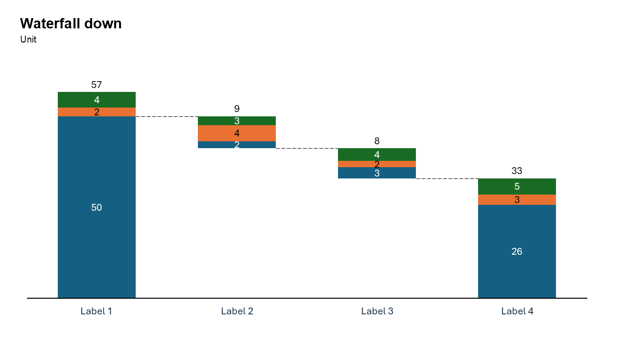
What is a Waterfall Build Down Chart?
A waterfall down chart focuses on negative changes, showing how reductions impact a final total. Each step represents a decline, making it ideal for analyzing losses.
- Revenue loss analysis
- Budget reductions
- Customer churn impact
Why Use It?
Focus on Reductions
Clearly shows how declines affect totals.
Simplifies Complex Data
Breaks down losses into understandable steps.
Better Storytelling
Helps present a logical narrative of decline.
Best Use Cases
- Revenue Loss: Returns, cancellations, discounts
- Expense Reduction: Cost-cutting analysis
- Customer Churn: Subscription drop impact
- Budget Cuts: Department-level reductions
When to Avoid It
Avoid using a waterfall down chart if you need to showcase both increases and decreases. A standard waterfall chart is better suited for mixed data
If you’re comparing multiple categories side by side, consider a bar or clustered bar chart instead
Tips for Better Charts
- Highlight Key Contributions: Use bold colors or annotations to emphasize the most impactful decreases.
- Add a Starting Point: Include a starting value to provide context for the reductions.
- Keep It Simple: Limit the number of categories to avoid clutter and ensure clarity.
- Label Clearly: Use descriptive labels and data values to make the chart easy to interpret.
- Use Gradual Steps: Arrange reductions in descending order of impact or by chronological sequence.
Examples of Waterfall Build Down Charts
Revenue Loss Breakdown
Show how product returns, customer cancellations, and discounts contribute to a decline in revenue.
Expense Reductions
Visualize the step-by-step breakdown of cost-cutting measures in a project or organization.
Impact of Customer Churn
Highlight how monthly churn rates affect the total number of active subscriptions.
Budget Cuts Across Departments
Illustrate how departmental budget cuts lead to an overall reduction in funding.
Advantages of Waterfall Build Down Charts
- Focused Narrative: By emphasizing reductions, the chart provides a clear story of decline and its contributing factors.
- Step-by-Step Clarity: The sequential breakdown ensures your audience can easily follow the data.
- Customizable: Tailor colors, labels, and formatting with Slidedoer for a polished, professional look.
- Audience-Friendly: Simplifies complex datasets into a clean, visually engaging chart.
Conclusion
The waterfall build down chart is an invaluable tool for illustrating declines and their contributing factors. Whether you're analyzing revenue losses, expense reductions, or the impact of churn, this chart type offers clarity and precision.
Related Charts
Waterfall Build Up Chart | | Waterfall Build Down Chart | | Combo Chart | | Error Bar Chart | | Line Chart | | 100% Stacked Mekko Chart | | Stacked Mekko Chart | | Stacked Bar Chart | | Clustered Bar Chart | | 100% Stacked Bar Chart | | Stacked Column Chart | | Clustered Column Chart | | 100% Stacked Column Chart | | 100% Stacked Area Chart | | Stacked Area Chart | | Scatter Plot Chart | | Bubble Chart | | Pie Chart | | Doughnut Chart | | Football Field Chart | | Gantt Chart
Create Better Charts in Seconds
Use Slidedoer PowerPoint Add-in to instantly build professional waterfall build down charts and 45+ business layouts.
Try Slidedoer