100% Stacked Mekko Chart in PowerPoint
The 100% Stacked Mekko Chart is a unique and insightful visualization tool designed to show proportional contributions across variable-width categories. It’s a perfect choice for emphasizing relative distributions while considering the overall size of each category.
Using the Slidedoer PowerPoint Add-in, you can create and customize 100% stacked Mekko charts effortlessly, ensuring that your presentations deliver data-rich visuals with clarity and impact. Let’s dive into what makes this chart type special, its applications, and how to create one.
What is a 100% Stacked Mekko Chart?
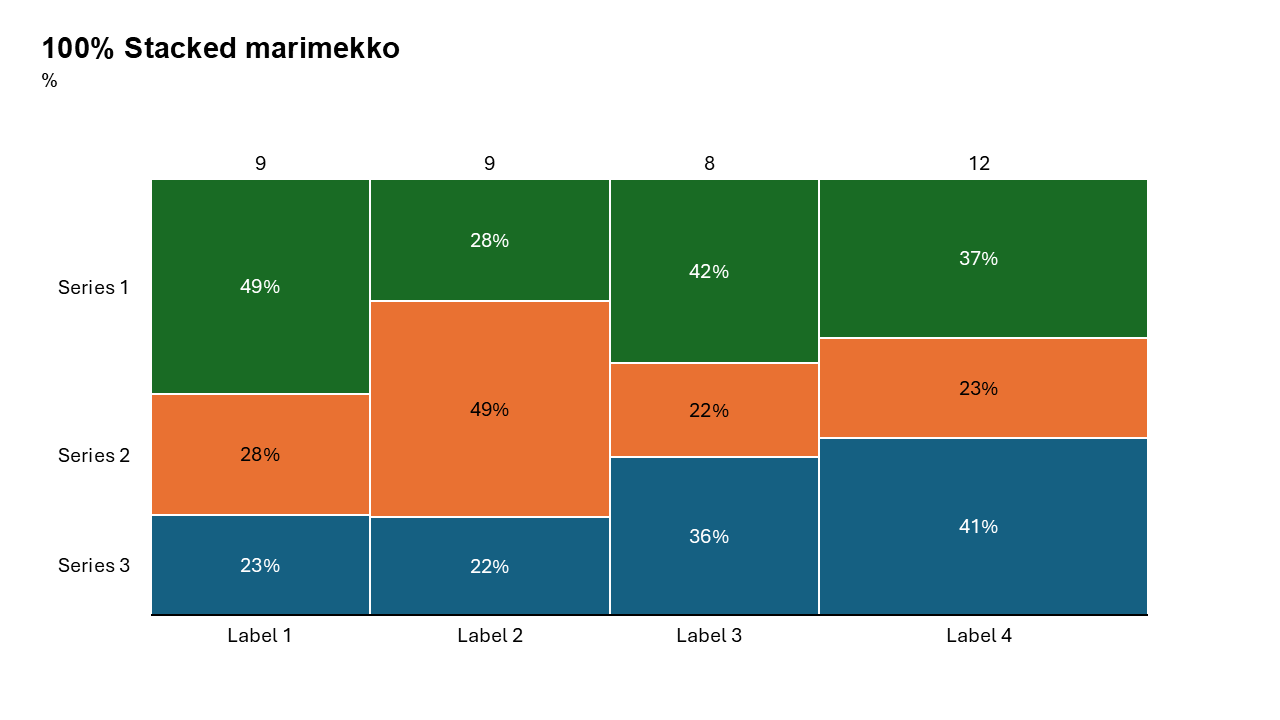
A 100% Stacked Mekko Chart visualizes data in a way that combines the benefits of a Mekko chart and a 100% stacked bar chart:
The width of each bar represents the total size of a category (e.g., revenue, market size). Each bar is divided into stacked segments representing subcategories as percentages of the total for that category. This format focuses on relative contributions while still highlighting the size of the categories.
- Comparing market share percentages of companies in different regions.
- Visualizing revenue contributions by product categories as a percentage of regional totals.
Why Use It?
Emphasize Proportions
Highlight the relative contributions of subcategories within each variable-width category.
Compare Across Categories
Analyze proportions while maintaining the context of category sizes.
Simplify Complex Data
Summarize multiple dimensions (size, proportions, distribution) in a single visualization.
Identify Trends
Spot patterns, outliers, or shifts in proportional contributions across categories.
Best Use Cases
- Market Share Analysis by Region: Compare the percentage contributions of companies within different regional markets, while emphasizing regional sizes.
- Revenue Breakdown by Product Line: Visualize product categories' revenue contributions as percentages of total revenues across various regions or business units.
- Budget Allocation by Department: Analyze how departments allocate their budgets as percentages of their total budget, while reflecting the total budget sizes.
- Customer Demographics: Show customer proportions (e.g., age groups, income brackets) in different geographic areas or customer segments.
When to Avoid It
Avoid 100% stacked Mekko charts if your audience needs absolute values, as this chart focuses on proportions. If your dataset has too many subcategories or is too granular, the chart might become hard to interpret.
Tips for Better Charts
- Use Intuitive Colors: Assign colors that align logically with your subcategories to aid quick interpretation.
- Add Data Labels: Include percentage labels for each segment to enhance understanding.
- Focus on Key Insights: Use callouts or annotations to draw attention to significant trends or outliers.
- Limit Categories: Avoid overcrowding by selecting a manageable number of categories and subcategories.
- Provide Context: Include a clear title, axis labels, and a legend to ensure your audience understands the chart.
Examples of 100% Stacked Mekko Charts
Market Share by Region
Illustrate the market share of companies as percentages of total market size across regions.
Revenue Contributions by Product Line
Show the percentage of revenue contributed by each product line within different regional markets, while considering the market size.
Customer Demographics by Location
Highlight customer proportions (e.g., gender, age) in different regions, scaled by total population size.
Budget Allocation by Department
Analyze departments’ budget allocation as percentages of their total budgets, while reflecting department sizes.
Advantages of 100% Stacked Mekko Charts
- Visualize Proportions and Sizes: Show proportional contributions within categories while reflecting their total sizes.
- Simplify Complex Data: Combine multiple data dimensions into a single, easy-to-read chart.
- Highlight Relationships: Compare proportional contributions across variable-width categories.
- Customizable: Easily create polished charts tailored to your presentation’s needs.
Conclusion
The 100% Stacked Mekko chart is a powerful tool for presenting proportional data in the context of varying category sizes. Whether you’re analyzing market share, revenue breakdowns, or customer demographics, this chart type enables you to deliver insights with clarity and precision.
Video link: Watch how you can do 100% mekko Chart with SlideDoer
Related Charts
Waterfall Build Up Chart | | Waterfall Build Down Chart | | Combo Chart | | Error Bar Chart | | Line Chart | | 100% Stacked Mekko Chart | | Stacked Mekko Chart | | Stacked Bar Chart | | Clustered Bar Chart | | 100% Stacked Bar Chart | | Stacked Column Chart | | Clustered Column Chart | | 100% Stacked Column Chart | | 100% Stacked Area Chart | | Stacked Area Chart | | Scatter Plot Chart | | Bubble Chart | | Pie Chart | | Doughnut Chart | | Football Field Chart | | Gantt Chart
Create Better Charts in Seconds
Use Slidedoer PowerPoint Add-in to instantly build professional 100% stacked mekko charts and 45+ business layouts.
Try Slidedoer