100% Horizontal Stacked Bar Chart in PowerPoint
When you want to emphasize proportions within categories while keeping everything visually clean and organized, the Horizontal 100% Stacked Bar Chart is your go-to option. It’s perfect for comparing percentages across categories, especially when you’re dealing with multiple components.
With the Slidedoer PowerPoint Add-in, creating professional horizontal 100% stacked bar charts becomes an effortless process. Let’s explore what makes this chart so powerful and how you can use it to elevate your presentations.
What is a 100% Horizontal Stacked Bar Chart?
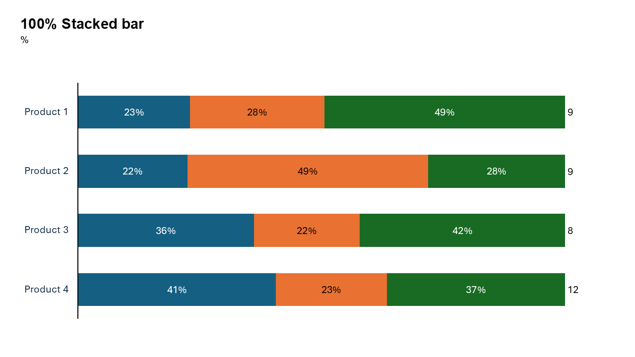
A horizontal 100% stacked bar chart is a type of bar chart where all categories are represented as horizontal bars that are normalized to 100%. Each bar is divided into segments, with each segment’s length corresponding to its proportion of the total. This makes it easy to compare distributions across categories.
- In a survey, you can display the percentage of respondents who chose different options (e.g., satisfied, neutral, dissatisfied).
- In business, you can highlight the proportion of revenue contributions from various products or services.
Why Use It?
Focus on Proportions
These charts normalize values, making it easy to compare proportions without worrying about differences in absolute totals.
Handle Long Labels
The horizontal layout is especially effective for displaying long category names without crowding the chart.
Show Distribution
Highlight how components (e.g., survey responses, revenue streams) are distributed within each category.
Simplify Complex Data
When dealing with percentages across multiple categories, a 100% stacked bar chart provides a clear and concise visualization.
Best Use Cases
- Survey Results: Display how responses (e.g., agree, neutral, disagree) are distributed across different demographic groups.
- Market Share Analysis: Show the percentage of market share held by different brands within various regions.
- Resource Allocation: Illustrate how budgets are proportionally allocated across departments or initiatives.
- Sales Breakdown: Compare the percentage contributions of product categories to total sales across different regions.
When to Avoid It
Avoid using this chart when the absolute totals for categories are more critical than their proportional distributions. In such cases, a simple horizontal stacked bar chart may be more appropriate.
Tips for Better Charts
- Use Distinct Colors: Assign unique, easily distinguishable colors to each segment.
- Add Descriptive Labels: Label each segment and category clearly to ensure the audience understands the data.
- Order Categories Logically: Arrange the categories in a meaningful order (e.g., by importance, alphabetically, or by another metric).
- Keep It Clean: Avoid too many segments per category to maintain clarity.
- Highlight Key Insights: Use annotations or color highlights to draw attention to the most important parts of the chart.
Examples of 100% Stacked Bar Charts
Employee Feedback
Visualize employee satisfaction levels (e.g., very satisfied, somewhat satisfied, dissatisfied) across different departments.
Marketing Channel Performance
Show the proportional contribution of each marketing channel (e.g., social media, email, PPC) to total leads generated by region.
Customer Demographics
Display the percentage breakdown of customer age groups across various regions or product categories.
Project Budget Allocation
Illustrate the proportional distribution of project expenses (e.g., research, development, marketing) across different projects.
Advantages of 100% Horizontal Stacked Bar Charts
- Clear Proportions: Normalize data for easy comparison of percentages across categories.
- Readable Labels: The horizontal layout accommodates long category names without clutter.
- Compact Presentation: Display multiple categories and segments in a concise format.
Conclusion
The 100% horizontal stacked bar chart is an excellent choice for visualizing proportions within categories, offering clarity and precision in data storytelling. Whether you’re analyzing survey results, market share, or resource allocation, this chart type helps your audience quickly grasp the key insights.
Related Charts
Waterfall Build Up Chart | | Waterfall Build Down Chart | | Combo Chart | | Error Bar Chart | | Line Chart | | 100% Stacked Mekko Chart | | Stacked Mekko Chart | | Stacked Bar Chart | | Clustered Bar Chart | | 100% Stacked Bar Chart | | Stacked Column Chart | | Clustered Column Chart | | 100% Stacked Column Chart | | 100% Stacked Area Chart | | Stacked Area Chart | | Scatter Plot Chart | | Bubble Chart | | Pie Chart | | Doughnut Chart | | Football Field Chart | | Gantt Chart
Create Better Charts in Seconds
Use Slidedoer PowerPoint Add-in to instantly build professional 100% horizontal stacked bar charts and 60+ business layouts.
Try Slidedoer