Stacked Mekko Chart in PowerPoint
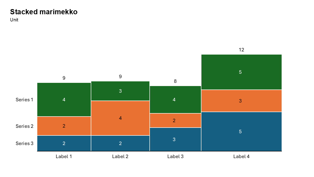
The Stacked Mekko Chart is an advanced visualization that builds upon the traditional Mekko chart by stacking data segments within each variable-width bar. This format is ideal for presenting multiple layers of information, offering a deeper understanding of data distribution, proportions, and relationships.
With the Slidedoer PowerPoint Add-in, creating and customizing stacked Mekko charts is a breeze. This blog post explores the key features of stacked Mekko charts, their use cases, and how you can create one to enhance your PowerPoint presentations.
What is a Stacked Mekko Chart?
A Stacked Mekko Chart combines the features of a stacked bar chart and a Mekko chart. In this chart:
Each bar's width represents the total size of a category. Each bar is divided into segments (stacked) that represent the proportional contributions of subcategories. The height of each segment reflects its value relative to the total of that category.
This dual representation allows for the visualization of three dimensions of data: category size, subcategory proportions, and total distribution.
- Market share of companies segmented by product categories.
- Revenue distribution across regions, further broken down by customer types.
Why Use It?
Multi-Dimensional Visualization
Represent multiple dimensions of data—category size, subcategory proportions, and overall distribution—all in one chart.
Highlight Relationships
Easily identify how subcategories contribute to the overall size of each category and the broader dataset.
Efficient Data Presentation
Consolidate complex datasets into a single, space-saving chart that is easy to interpret.
Comprehensive Insights
Enable your audience to grasp relationships and trends at a glance.
Best Use Cases
- Market Share Analysis by Product Line: Compare companies’ market shares, segmented by product categories.
- Revenue Distribution by Region and Customer Type: Visualize regional revenue contributions, further broken down by customer demographics.
- Budget Allocation Analysis: Analyze departmental budgets by expense categories, while comparing the overall budget sizes.
- Sales by Product and Channel: Show sales figures for each product category, segmented by sales channels (e.g., online, retail, wholesale).
When to Avoid It
Avoid using stacked Mekko charts for small datasets, as simpler charts like bar or column charts may suffice. If there are too many categories or subcategories, the chart may become cluttered and hard to interpret.
Tips for Better Charts
- Use Distinct Colors: Assign contrasting colors to subcategory segments for clear differentiation.
- Add Data Labels: Include precise values or percentages for key segments to enhance readability.
- Simplify the Layout: Limit the number of categories and subcategories to avoid clutter.
- Include Contextual Information: Add a descriptive title, axis labels, and a legend for better understanding.
- Highlight Key Insights: Use annotations or callouts to emphasize significant trends or outliers.
Examples of Stacked Mekko Charts
Market Share by Product and Segment
Show the market share of companies, segmented by product categories (e.g., electronics, clothing, and home goods).
Revenue Distribution by Region and Customer Type
Visualize how regional revenues are distributed across customer types (e.g., B2B, B2C).
Expense Breakdown by Department and Category
Analyze departmental budgets, segmented by expense categories (e.g., salaries, travel, and marketing).
Sales by Product and Channel
Display sales figures for product categories, further broken down by channels like online, retail, or wholesale.
Advantages of Stacked Mekko Charts
- Multi-Dimensional Representation: Display category sizes, subcategory proportions, and total distributions in a single chart.
- Highlight Contributions: Easily identify which subcategories contribute most to each category and the overall dataset.
- Space-Saving Design: Combine data that would typically require multiple charts into one cohesive visualization.
- Customizable: Create polished, professional charts tailored to your specific needs.
Conclusion
The Stacked Mekko chart is a versatile and impactful tool for visualizing multi-dimensional datasets. Whether you’re analyzing market share, revenue distribution, or expense breakdowns, this chart format enables you to present complex information with clarity and precision.
With the Slidedoer PowerPoint Add-in, you can create and customize stunning stacked Mekko charts in minutes. Elevate your presentations by turning raw data into meaningful visuals that captivate your audience.
Related Charts
Waterfall Build Up Chart | | Waterfall Build Down Chart | | Combo Chart | | Error Bar Chart | | Line Chart | | 100% Stacked Mekko Chart | | Stacked Mekko Chart | | Stacked Bar Chart | | Clustered Bar Chart | | 100% Stacked Bar Chart | | Stacked Column Chart | | Clustered Column Chart | | 100% Stacked Column Chart | | 100% Stacked Area Chart | | Stacked Area Chart | | Scatter Plot Chart | | Bubble Chart | | Pie Chart | | Doughnut Chart | | Football Field Chart | | Gantt Chart
Create Better Charts in Seconds
Use Slidedoer PowerPoint Add-in to instantly build professional stacked mekko charts and 60+ business layouts.
Try Slidedoer