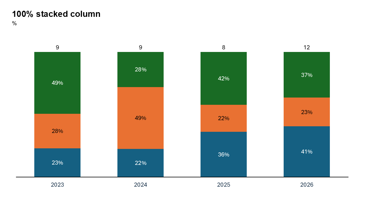
100% Vertical Stacked Column Chart in PowerPoint
When you need to present data as proportions while maintaining comparisons across categories, the 100% stacked column chart is your ideal choice. This chart type is widely used to display the composition of a whole while ensuring that all categories are visually comparable on a normalized scale.
With the Slidedoer PowerPoint Add-in, you can easily create 100% stacked column charts that are both visually appealing and insightful. Let’s explore what makes this chart type unique, its best use cases, and how to create one using Slidedoer.
What is a 100% Vertical Stacked Column Chart?
A 100% stacked column chart represents data as columns divided into segments, where the total value of each column equals 100%. Each segment shows the proportional contribution of a category, allowing for easy comparison across multiple groups.
- Visualizing the percentage of revenue contributions from different product lines for each quarter.
- Displaying the distribution of customer demographics (e.g., age groups, genders) across regions.
Why Use It?
Show Proportional Data
Highlight how individual components contribute to a whole as percentages, without focusing on absolute values.
Compare Across Categories
Compare proportions for multiple categories side by side, providing a clear view of trends and differences.
Maintain a Consistent Scale
By normalizing each column to 100%, this chart type ensures a fair and accurate comparison.
Simplify Complex Data
Condense large datasets into a clear, easy-to-read visual format.
Best Use Cases
- Sales Contributions: Show the percentage of revenue from different product lines or sales channels across time periods.
- Demographic Analysis: Highlight the proportional distribution of age groups, genders, or income levels across regions or years.
- Resource Allocation: Display how a department’s budget is distributed among various expense categories.
- Market Share: Visualize the percentage market share of competitors in different geographic locations.
When to Avoid It
If absolute values are critical, consider using a regular stacked column chart instead. Avoid using this chart type for datasets with too many categories or segments, as it can become cluttered.
Tips for Better Charts
- Use Distinct Colors: Assign unique colors to each segment for better differentiation.
- Add Percentage Labels: Include labels that show exact percentages to improve clarity.
- Limit the Number of Segments: Focus on the most relevant data series to avoid overcrowding the chart.
- Provide Context: Add a clear title, axis labels, and a legend to make the chart self-explanatory.
- Highlight Key Insights: Use annotations or bold colors to emphasize significant trends or patterns.
Examples of 100% Stacked Column Charts
Revenue Breakdown
Illustrate how different product categories contribute to total revenue as percentages over several quarters.
Employee Diversity
Show the proportional representation of various demographic groups within a company across years.
Market Share Analysis
Highlight the percentage share of competitors in various geographic markets.
Expense Distribution
Visualize how a company’s expenses are divided among categories like salaries, marketing, and operations.
Advantages of 100% Horizontal Stacked Column Charts
- Proportional Representation: Clearly shows the composition of a whole for each category.
- Easy Comparisons: Facilitates side-by-side comparisons of percentages across multiple groups.
- Clean and Professional Look: Perfect for corporate presentations and analytical reports.
Conclusion
The 100% horizontal stacked column chart is a powerful visualization tool for showcasing proportional data and identifying trends across categories. Whether you're analyzing sales contributions, demographic distributions, or market shares, this chart type helps you deliver insights with clarity and impact.
Related Charts
Waterfall Build Up Chart | | Waterfall Build Down Chart | | Combo Chart | | Error Bar Chart | | Line Chart | | 100% Stacked Mekko Chart | | Stacked Mekko Chart | | Stacked Bar Chart | | Clustered Bar Chart | | 100% Stacked Bar Chart | | Stacked Column Chart | | Clustered Column Chart | | 100% Stacked Column Chart | | 100% Stacked Area Chart | | Stacked Area Chart | | Scatter Plot Chart | | Bubble Chart | | Pie Chart | | Doughnut Chart | | Football Field Chart | | Gantt Chart
Create Better Charts in Seconds
Use Slidedoer PowerPoint Add-in to instantly build professional 100% horizontal stacked column charts and 45+ business layouts.
Try Slidedoer