Pie in PowerPoint
The Pie Chart is one of the simplest and most widely recognized chart types, ideal for illustrating proportions and relative contributions. Its circular format provides a clear visual representation of how different components contribute to a whole, making it an essential tool for storytellers and data analysts alike.
With the Slidedoer PowerPoint Add-in, creating and customizing pie charts for your presentations becomes a seamless process. This blog post will explore the fundamentals of pie charts, their use cases, and how to make them impactful in your PowerPoint slides.
What is a Pie Chart?
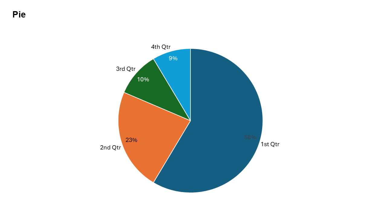
A Pie Chart is a circular chart divided into slices, where:
Each slice represents a category.
The size of each slice is proportional to its value relative to the total
- Representing the market share of different companies in a sector.
- Showing the percentage distribution of expenses in a budget.
Why Use It?
Simple and Intuitive
Pie charts are universally understood and easy to interpret, making them effective for communicating simple proportions.
Focus on Key Segments
Highlight major contributors and comparisons within a dataset.
Ideal for Small Datasets
Best suited for datasets with a few categories, ensuring clarity without clutter.
Visually Engaging
Their circular format draws attention and adds visual variety to presentations.
Best Use Cases
- Market Share Analysis: Show how different competitors contribute to the total market.
- Expense Distribution: Highlight the percentage allocation of a budget across various departments or expense categories.
- Survey Results: Represent the percentage breakdown of responses to a survey question.
- Revenue Sources: Illustrate the contribution of different revenue streams to the total income.
When to Avoid It
Avoid pie charts for datasets with too many categories, as it can make the chart cluttered and hard to read. They are not ideal for precise comparisons; bar or column charts might work better in such cases.
Tips for Better Charts
- Limit Categories: Use pie charts for datasets with fewer than six categories to maintain clarity.
- Use Contrasting Colors: Assign distinct, contrasting colors to slices for better differentiation.
- Label Key Segments: Include percentage or value labels on the slices to enhance readability.
- Highlight Important Insights: Use callouts or annotations to emphasize significant slices.
- Avoid 3D Effects: Stick to flat, 2D pie charts for better accuracy and readability.
Examples of Pie Charts
Budget Allocation
Show how a company’s budget is divided among departments like marketing, HR, and R&D.
Market Share Analysis
Visualize how competitors contribute to the overall market in a specific industry.
Revenue Breakdown
Represent the percentage of revenue generated by different product lines.
Survey Results
Display the percentage of responses to a survey question, such as customer satisfaction levels.
Advantages of Pie Charts
- Quickly Understand Proportions: Ideal for illustrating how categories contribute to a total.
Conclusion
The Pie chart remains a classic and effective way to communicate proportions and relative contributions. Whether you’re analyzing market share, budget allocations, or survey results, pie charts offer a simple yet impactful way to present your data.
Related Charts
Waterfall Build Up Chart | | Waterfall Build Down Chart | | Combo Chart | | Error Bar Chart | | Line Chart | | 100% Stacked Mekko Chart | | Stacked Mekko Chart | | Stacked Bar Chart | | Clustered Bar Chart | | 100% Stacked Bar Chart | | Stacked Column Chart | | Clustered Column Chart | | 100% Stacked Column Chart | | 100% Stacked Area Chart | | Stacked Area Chart | | Scatter Plot Chart | | Bubble Chart | | Pie Chart | | Doughnut Chart | | Football Field Chart | | Gantt Chart
Create Better Charts in Seconds
Use Slidedoer PowerPoint Add-in to instantly build professional pie charts and 60+ business layouts.
Try Slidedoer