100% Stacked Area Chart in PowerPoint
When you want to showcase relative contributions over time while maintaining a clear view of the total as a constant (100%), the 100% stacked area chart is your go-to visualization. This powerful chart type emphasizes proportions rather than absolute values, making it ideal for comparing parts of a whole across categories.
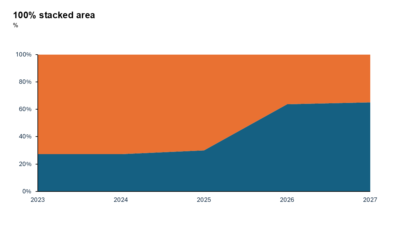
What is a 100% Stacked Area Chart?
A 100% stacked area chart is a variation of the stacked area chart where all values are normalized to a percentage of 100%. Each layer in the chart represents a category’s share of the total, and the cumulative stack always adds up to 100%.
- Market share trends across competitors.
- Monthly traffic sources on a website.
- Budget allocations for different departments over time.
Why Use It?
Relative Comparison
Focuses on the percentage distribution of categories rather than absolute values.
Trends Over Time
Allows viewers to see how the proportions of categories change over time.
Emphasizes Part-to-Whole
Perfect for showing how categories contribute to a whole without being distracted by variations in total size.
Best Use Cases
- Market Share Analysis: See how competitors’ shares evolve over time.
- Budget Breakdown: Track how spending categories shift over months or years.
- Traffic Sources: Visualize the proportion of traffic coming from search, social media, direct, and referrals.
When to Avoid It
Avoid if you need to emphasize absolute values instead of proportions. If trends for individual categories aren’t visually distinct, consider alternative charts like line charts.
Tips for Better Charts
- Limit Categories: Too many layers can make the chart cluttered. Aim for 3–5 key categories.
- Use Contrasting Colors: Ensure each layer stands out by using distinct colors.
- Add Clear Labels: Use percentage labels or a well-placed legend to help the audience interpret the chart.
- Avoid Overcrowding: Focus on the most important trends to keep the visualization clean and effective.
Examples of 100% Stacked Area Charts
Website Traffic Sources
See how traffic from organic search, social media, email campaigns, and paid ads contributes to total visits over time.
Market Share Trends
Visualize the competitive landscape by showing how different brands' shares evolve year by year.
Energy Mix
Track the proportion of energy derived from renewable, nuclear, and fossil fuel sources over the last decade.
Advantages of 100% Stacked Area Charts
- Focus on Distribution: Highlights the proportional contributions of categories.
- Simplifies Trends: Makes it easy to see shifts in category dominance over time.
- Great for Visual Storytelling: Keeps your audience focused on relative changes without being distracted by absolute fluctuations.
Conclusion
The 100% stacked area chart is a powerful tool for highlighting proportions over time. Whether you’re analyzing market share, energy consumption, or budget allocations, it’s an excellent way to communicate shifts in relative contributions while keeping the total constant.
Related Charts
Waterfall Build Up Chart | | Waterfall Build Down Chart | | Combo Chart | | Error Bar Chart | | Line Chart | | 100% Stacked Mekko Chart | | Stacked Mekko Chart | | Stacked Bar Chart | | Clustered Bar Chart | | 100% Stacked Bar Chart | | Stacked Column Chart | | Clustered Column Chart | | 100% Stacked Column Chart | | 100% Stacked Area Chart | | Stacked Area Chart | | Scatter Plot Chart | | Bubble Chart | | Pie Chart | | Doughnut Chart | | Football Field Chart | | Gantt Chart
Create Better Charts in Seconds
Use Slidedoer PowerPoint Add-in to instantly build professional 100% stacked area charts and 60+ business layouts.
Try Slidedoer