Horizontal Clustered Bar Chart in PowerPoint
When you need to compare multiple values across categories in a visually intuitive way, the horizontal clustered bar chart is an excellent choice. It’s especially useful for presenting datasets where comparing groups or subcategories side by side is critical.
With the Slidedoer PowerPoint Add-in, you can quickly create professional horizontal clustered bar charts and customize them to suit your presentation needs. Let’s dive into the details and benefits of this chart type.
What is a Horizontal Clustered Bar Chart?
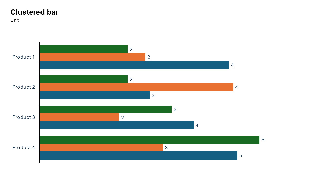
A horizontal clustered bar chart is a type of bar chart where categories are represented as groups of horizontal bars, with each bar in the group corresponding to a different data series. The bars are displayed side by side for each category, making it easy to compare multiple datasets within the same category.
- Comparing sales performance of multiple products across regions.
- Showing survey responses for different demographic groups.
Why Use It?
Compare Multiple Data Series
Horizontal clustered bar charts make it easy to compare different data series (e.g., different products, years, or groups) side by side for each category.
Accommodate Long Labels
The horizontal layout is perfect for categories with long names, keeping the chart clean and easy to read.
Highlight Trends Across Groups
They are great for identifying patterns or trends across subcategories within a category.
Easy to Interpret
The side-by-side grouping ensures your audience can quickly grasp relationships between datasets.
Best Use Cases
- Sales Comparisons: Compare product sales across different regions or time periods.
- Survey Analysis: Visualize survey responses (e.g., satisfaction levels) across multiple demographic groups.
- Performance Metrics: Analyze key performance indicators (KPIs) for multiple teams or departments.
- Resource Distribution: Compare resource allocation (e.g., budgets, manpower) across projects.
When to Avoid It
Avoid using this chart if there are too many data series, as it may make the chart cluttered and hard to read. For visualizing proportions within categories, consider a horizontal stacked bar chart instead.
Tips for Better Charts
- Limit the Number of Groups: Too many categories or data series can overwhelm the audience. Keep it concise.
- Use Consistent Colors: Assign consistent colors to the same data series across slides to maintain visual continuity.
- Label Clearly: Ensure all categories, data series, and axis labels are descriptive and easy to read.
- Sort Data Logically: Arrange categories in a logical order, such as ascending/descending values or alphabetically.
- Highlight Key Data: Use bold colors or annotations to emphasize important comparisons or trends.
Examples of Horizontal Clustered Bar Charts
Product Sales by Region
Compare sales performance of multiple products (e.g., Product A, B, C) across various regions.
Employee Satisfaction Across Departments
Visualize satisfaction levels (e.g., very satisfied, neutral, dissatisfied) across different departments.
Yearly Revenue Growth
Show revenue growth for multiple years across different business units.
Marketing Campaign Effectiveness
Compare the performance of different marketing campaigns (e.g., email, social media, TV ads) across geographic locations.
Advantages of Horizontal Clustered Bar Charts
- Clear Comparisons: Display multiple data series side by side for easy comparison.
- Accommodates Long Labels: Perfect for datasets with lengthy category names.
- Highlight Trends Across Groups: Easily identify relationships and trends between subcategories.
Conclusion
The horizontal clustered bar chart is an indispensable tool for presenting multi-series comparisons. Whether you're analyzing sales, survey results, or performance metrics, this chart type delivers clarity and precision, ensuring your audience quickly grasps the insights.
Related Charts
Waterfall Build Up Chart | | Waterfall Build Down Chart | | Combo Chart | | Error Bar Chart | | Line Chart | | 100% Stacked Mekko Chart | | Stacked Mekko Chart | | Stacked Bar Chart | | Clustered Bar Chart | | 100% Stacked Bar Chart | | Stacked Column Chart | | Clustered Column Chart | | 100% Stacked Column Chart | | 100% Stacked Area Chart | | Stacked Area Chart | | Scatter Plot Chart | | Bubble Chart | | Pie Chart | | Doughnut Chart | | Football Field Chart | | Gantt Chart
Create Better Charts in Seconds
Use Slidedoer PowerPoint Add-in to instantly build professional clustered bar charts and 60+ business layouts.
Try Slidedoer