Bubble Chart in PowerPoint
When your dataset involves three variables and you want to represent them in a single, engaging visualization, the bubble chart is the perfect choice. It combines the simplicity of a scatter plot with the added dimension of bubble size to convey additional meaning.
With the Slidedoer PowerPoint Add-in, creating and customizing bubble charts is straightforward, making it easy to showcase complex data in a visually appealing and professional manner. Let’s explore the key features, use cases, and benefits of bubble charts.
What is a Bubble Chart?
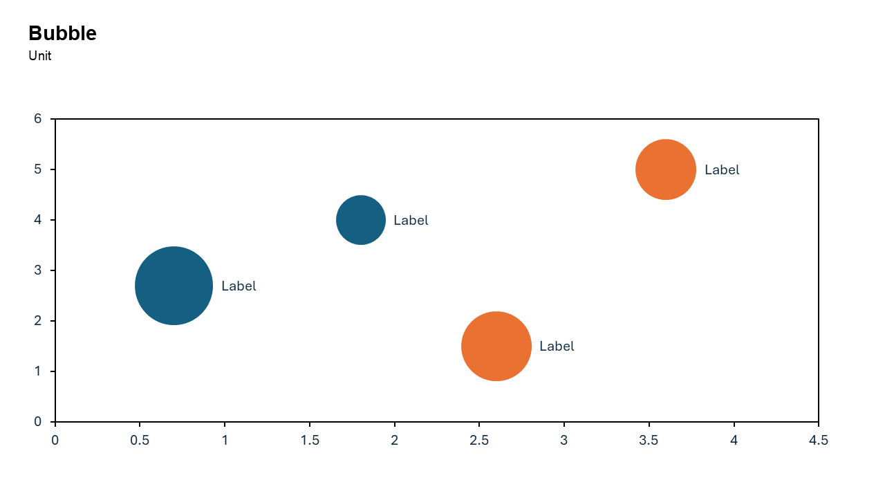
A bubble chart is a type of data visualization that uses bubbles (circles) to represent three dimensions of data.
X-axis: Represents one variable (e.g., time or a category).
Y-axis: Represents a second variable (e.g., performance or value).
Bubble size: Indicates the magnitude of the third variable (e.g., population, sales, or impact).
- A bubble chart could plot countries on the X and Y axes based on GDP and life expectancy, with bubble size representing population.
- In a business context, it could showcase product sales, customer satisfaction scores, and market share.
Why Use It?
Multidimensional Data Representation
Bubble charts allow you to visualize three variables at once, providing a richer context for decision-making.
Identify Trends and Relationships
They help you spot correlations, outliers, and patterns in the data.
Engaging and Intuitive
The varying bubble sizes make the chart visually engaging and easy to interpret, even for non-technical audiences.
Highlight Key Insights
Larger bubbles naturally draw attention, helping you emphasize critical data points.
Best Use Cases
- Market Analysis: Compare competitors based on revenue, market share, and customer satisfaction.
- Product Portfolio Analysis: Visualize product sales, profitability, and market size.
- Customer Segmentation: Plot customer groups based on demographics, spending habits, and loyalty.
- Risk Assessment: Highlight risks by severity, probability, and potential impact.
When to Avoid It
Avoid using bubble charts for datasets with too many variables or categories, as overlapping bubbles can clutter the visualization. If you only have two variables to represent, a scatter plot may be more appropriate.
Tips for Better Charts
- Keep It Clean: Limit the number of bubbles to avoid overcrowding and ensure clarity.
- Use Meaningful Sizes: Ensure the bubble sizes accurately reflect the magnitude of the third variable.
- Label Key Bubbles: Add labels to the most critical data points for easier interpretation.
- Use Contrasting Colors: Assign distinct colors to bubbles representing different categories or groups.
- Sort by Importance: Highlight the most important bubbles by size, color, or placement.
Examples of Bubble Charts
Market Share Analysis
Plot companies on the X and Y axes based on revenue and profitability, with bubble size representing market share.
Sales Performance
Visualize products by price and sales volume, with bubble size representing customer ratings.
Project Management
Plot project tasks by priority and completion time, with bubble size representing resource allocation.
Social Impact Analysis
Highlight countries based on GDP and literacy rate, with bubble size representing population.
Advantages of Bubble Charts
- Visual Appeal: The varying bubble sizes make the chart engaging and attention-grabbing.
- Comprehensive Insight: Captures three dimensions of data in a single chart.
- Easy to Interpret: Intuitive design ensures even complex data is easy to understand.
Conclusion
The bubble chart is a powerful tool for presenting multi-dimensional data in an engaging and intuitive way. Whether you’re analyzing markets, visualizing sales performance, or assessing risks, a bubble chart enables you to communicate insights effectively.
With the Slidedoer PowerPoint Add-in, you can create professional bubble charts in no time, allowing you to focus on delivering impactful presentations. Try Slidedoer today and elevate your data storytelling!
Video link: Watch how you can do Bubble Chart with SlideDoer
Related Charts
Waterfall Build Up Chart | | Waterfall Build Down Chart | | Combo Chart | | Error Bar Chart | | Line Chart | | 100% Stacked Mekko Chart | | Stacked Mekko Chart | | Stacked Bar Chart | | Clustered Bar Chart | | 100% Stacked Bar Chart | | Stacked Column Chart | | Clustered Column Chart | | 100% Stacked Column Chart | | 100% Stacked Area Chart | | Stacked Area Chart | | Scatter Plot Chart | | Bubble Chart | | Pie Chart | | Doughnut Chart | | Football Field Chart | | Gantt Chart
Create Better Charts in Seconds
Use Slidedoer PowerPoint Add-in to instantly build professional bubble charts and 60+ business layouts.
Try Slidedoer