Stacked Area Chart in PowerPoint
When presenting data trends over time, a stacked area chart is an excellent choice to showcase cumulative values across multiple categories. This chart type not only highlights individual contributions but also gives a clear picture of the whole. With the Slidedoer PowerPoint Add-in, creating stunning stacked area charts is easier than ever.
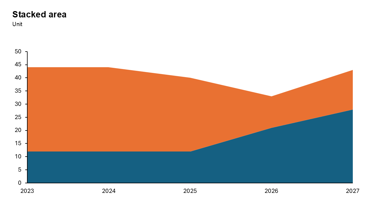
What is a Stacked Area Chart?
A stacked area chart displays data as layers of areas stacked on top of each other, where each layer represents a category. The height of the stack shows the cumulative value, while individual layers reveal the contribution of each category.
- a company might use a stacked area chart to visualize revenue from different product lines over several years.
Why Use It?
Show Part-to-Whole Relationships
Stacked area charts clearly represent how individual components (categories) contribute to the total over time.
Highlight Trends
They are ideal for tracking trends across categories while focusing on the overall growth or decline.
Simplify Data Interpretation
By stacking categories, you eliminate the need to compare multiple lines or bars.
Best Use Cases
- Total Market Growth: Show how individual segments contribute to the overall expansion of an entire industry.
- Cumulative Sales Trends: Track multiple product lines over time to see the total revenue volume generated.
- Resource Allocation Changes: Monitor how different departments utilize a fixed budget over several fiscal quarters.
- Website Traffic Sources: Visualize the total volume of visitors broken down by organic, social, and direct.
- Population Demographic Shifts: Display how various age groups contribute to a country's total population over decades.
When to Avoid It
Avoid using this chart if you have more than five categories or if individual data series fluctuate wildly, as this creates a "jagged" look that is difficult to read. It is also poor for comparing the exact values of middle segments.
Tips for Better Charts
- Limit Categories: Too many categories can make the chart cluttered. Stick to 3–5 key contributors.
- Use Contrasting Colors: Differentiate layers with distinct colors for better readability.
- Provide Context: Label axes clearly and add a legend to explain categories.
- Avoid Data Overload: Ensure the chart focuses on essential trends without overwhelming the audience.
Examples of Stacked Area Charts
Sales Performance
Compare revenue contributions from different regions over the last 5 years.
Energy Usage
Visualize the share of renewable vs. non-renewable energy sources over time.
Website Traffic
Track traffic contributions from organic search, paid ads, and social media.
Advantages of Stacked Area Charts
- Shows Part-to-Whole: Effectively illustrates how smaller components add up to a single, cumulative total value.
- Emphasizes Total Volume: Provides a clear visual representation of the overall magnitude of change over time.
- Highlights Trend Patterns: Makes it easy to spot long-term growth or decline across multiple data categories.
Conclusion
The stacked area chart is a powerful tool for showing how different parts contribute to a total over time. Use it when volume and cumulative trends matter more than precise individual values.
Related Charts
Waterfall Build Up Chart | | Waterfall Build Down Chart | | Combo Chart | | Error Bar Chart | | Line Chart | | 100% Stacked Mekko Chart | | Stacked Mekko Chart | | Stacked Bar Chart | | Clustered Bar Chart | | 100% Stacked Bar Chart | | Stacked Column Chart | | Clustered Column Chart | | 100% Stacked Column Chart | | 100% Stacked Area Chart | | Stacked Area Chart | | Scatter Plot Chart | | Bubble Chart | | Pie Chart | | Doughnut Chart | | Football Field Chart | | Gantt Chart
Create Better Charts in Seconds
Use Slidedoer PowerPoint Add-in to instantly build professional stacked area charts and 60+ business layouts.
Try Slidedoer