Error Bar Chart in PowerPoint
When presenting data, it’s crucial to communicate not only the values but also the uncertainty or variability associated with them. This is where Error Bar Charts come into play. They add a layer of depth by visualizing the margins of error, confidence intervals, or standard deviations, helping your audience understand the reliability of your data.
With the Slidedoer PowerPoint Add-in, you can create polished error bar charts that balance clarity and precision. Let’s explore what error bar charts are and how you can leverage them to make your presentations more impactful.
What is a Error Bar Chart?
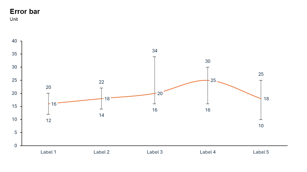
An error bar chart is a visual representation that adds error bars to standard charts (e.g., bar charts, line charts, scatter plots). These error bars indicate the variability or uncertainty in the data, helping viewers understand the potential range of values.
- in scientific research, error bars are often used to show confidence intervals or standard deviations, while in business, they can highlight forecast uncertainties.
Why Use It?
Visualize Uncertainty
Error bars provide a visual cue about the variability or precision of your data, making it easier for viewers to interpret results.
Enhance Credibility
By showing margins of error, you demonstrate transparency and build trust with your audience.
Support Data Comparisons
Error bars make it easier to identify significant differences or overlaps between data points.
Provide Context
They offer additional context for decision-making, particularly in situations where data accuracy is crucial.
Best Use Cases
- Scientific Research: Display experiment results with variability.
- Financial Forecasting: Show the potential range of predicted revenue or expenses.
- Market Analysis: Highlight uncertainty in survey results or customer feedback.
- Performance Metrics: Illustrate variability in key performance indicators (KPIs).
When to Avoid It
Avoid error bar charts when data is small, skewed, or highly noisy, as bars obscure distributions and imply false precision.
Tips for Better Charts
- Keep It Simple: Avoid overcrowding the chart with too many data points or overlapping error bars.
- Use Descriptive Labels: Clearly label axes, data points, and error bars to ensure your audience understands the chart.
- Choose the Right Error Type: Match the error bar type to your data and analysis goals (e.g., confidence intervals for survey data).
- Add a Legend: If using multiple types of error bars, provide a legend to clarify their meaning.
- Focus on Key Data: Highlight the most important trends or differences to keep the chart focused.
Examples of Error Bar Charts
Scientific Experiment Results
Show the average results of an experiment along with the standard deviation to indicate variability across trials.
Financial Forecast
Display monthly revenue predictions with error bars representing the potential range of deviation.
Customer Satisfaction
Present survey results with confidence intervals to emphasize the reliability of the findings.
Advantages of Error Bar Charts
- Communicate Data Reliability: Error bars add context to your data, helping your audience understand its accuracy.
- Simplify Complex Concepts: They break down uncertainty into an easy-to-understand visual.
- Support Critical Decisions: By providing context, they improve decision-making in business, research, and other fields.
Conclusion
The error bar chart is an invaluable tool for adding depth and context to your data presentations. Whether you’re showcasing scientific results, financial forecasts, or performance metrics, error bars help your audience grasp the variability and reliability of your data.
Related Charts
Waterfall Build Up Chart | | Waterfall Build Down Chart | | Combo Chart | | Error Bar Chart | | Line Chart | | 100% Stacked Mekko Chart | | Stacked Mekko Chart | | Stacked Bar Chart | | Clustered Bar Chart | | 100% Stacked Bar Chart | | Stacked Column Chart | | Clustered Column Chart | | 100% Stacked Column Chart | | 100% Stacked Area Chart | | Stacked Area Chart | | Scatter Plot Chart | | Bubble Chart | | Pie Chart | | Doughnut Chart | | Football Field Chart | | Gantt Chart
Create Better Charts in Seconds
Use Slidedoer PowerPoint Add-in to instantly build professional error bar charts and 60+ business layouts.
Try Slidedoer