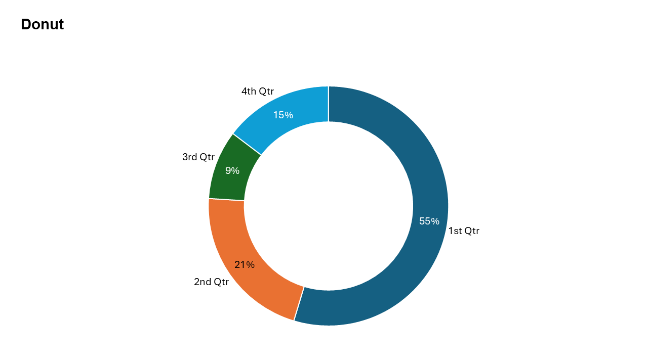
Doughnut Chart
A modern variation of the pie chart used to display proportional data with a central space for emphasis.
Common uses: Market share, sales breakdown, survey results, and budget allocation.
Key Insight: A well-designed donut chart instantly tells you which part is the largest and which is the smallest.
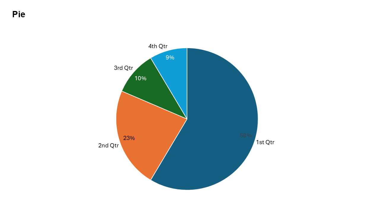
Pie Chart
A classic chart used to represent proportions and percentage contributions of a whole.
Common uses: Market share, sales breakdown, survey results, and budget allocation.
Key Insight: Best for showing parts-to-whole relationships when differences between slices are clearly distinct.
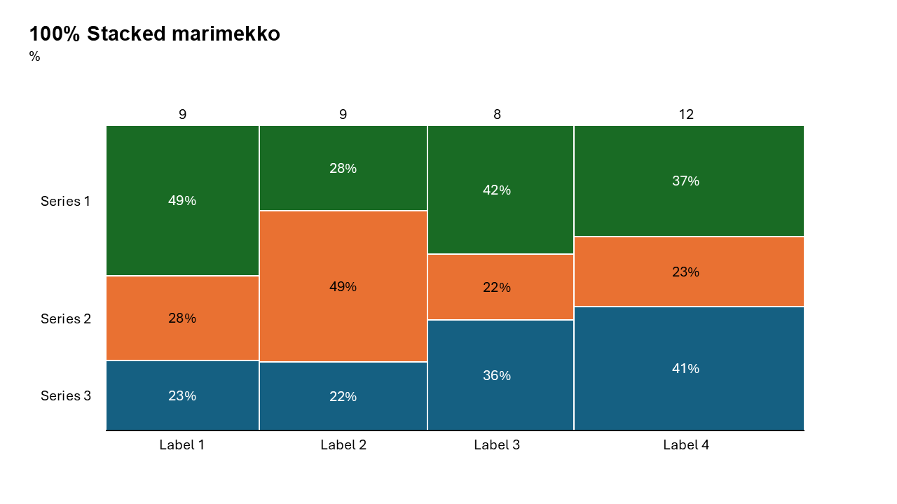
100% Stacked Mekko Chart
It simultaneously visualizes the proportional breakdown of categories (y-axis) and the relative size of those categories (x-axis).
Common uses: Market share analysis, revenue segmentation by region, budget allocation, and financial portfolio composition.
Key Insight: Highlights which sub-categories dominate within a group, while revealing the relative weight of the group itself.
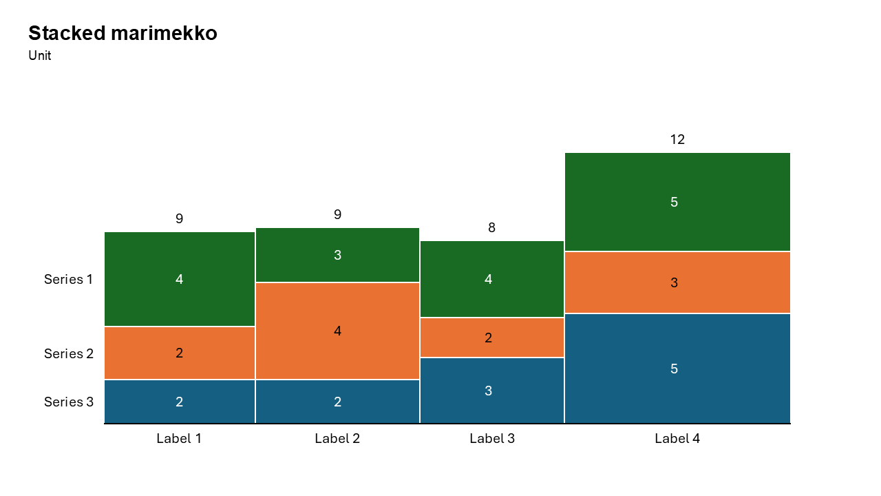
Stacked Mekko Chart
A stacked mekko (Marimekko) chart is a two-dimensional visualization that varies both column width and segment height to represent two categorical variables simultaneously
Common uses: Market share analysis, Portfolio Analysis, Resource Allocation.
Key Insight: Instantly compares internal structure (e.g., product mix) across categories and the total scale of those categories (e.g., market share) in one view.
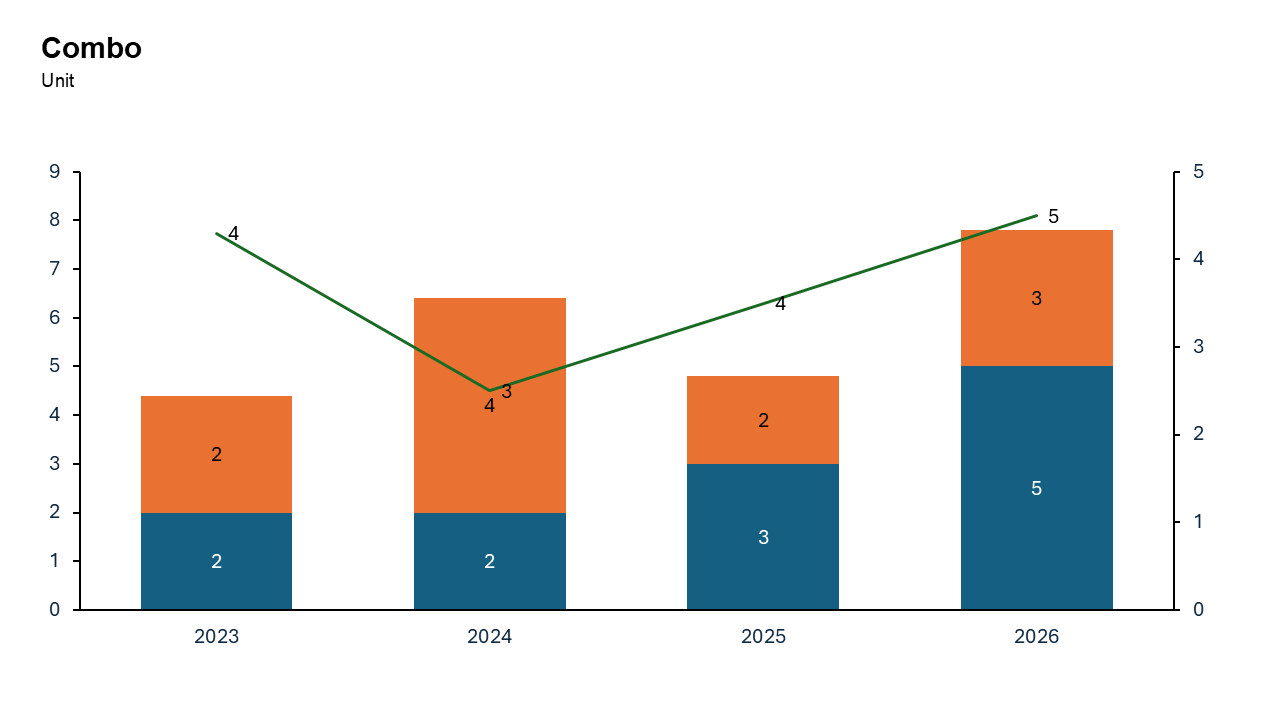
Combo Chart
Combines columns and lines to visualize both values and trends in one chart.
Common uses: Tracking monthly sales (bars) against profit margins (line), comparing quantity vs. percentage change, and analyzing Pareto principles.
Key Insight: Enables instant visual comparison of disparate metrics (e.g., volume and percentage), highlighting correlations or variances, such as actual performance versus targets.
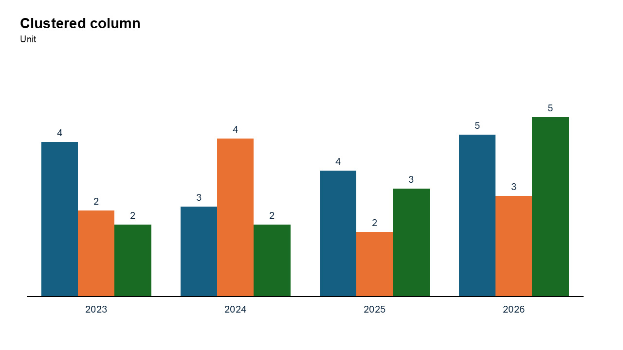
Clustered Column Chart
Best for comparing multiple data series across categories.
Common uses: Tracking performance metrics for multiple items, comparing sales across regions or time periods.
Key Insight: Highly effective for comparing limited categorical data sets (e.g., product sales by region), but becomes cluttered with too many data points.
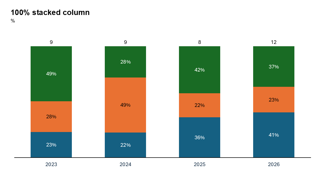
100% Stacked Column Chart
Each column represents 100% of a total, divided into segments showing the relative percentage of subcategories.
Common uses: Survey Analysis, Market Share, Budgeting and Performance Tracking.
Key Insight: It highlights relative proportions rather than absolute values, enabling easy comparison of subcategory contributions across different categories (e.g., product mix over time).
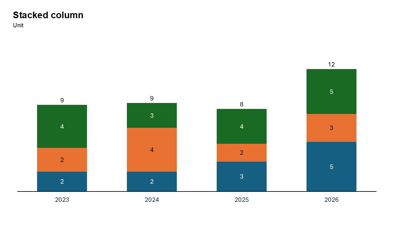
Stacked Column Chart
Segments are stacked on top of each other, making it easy to see both the individual components and the total value for each category.
Common uses: Sales/Revenue, Budgeting, Demographics.
Key Insight: Instantly compares overall category totals while displaying the relative composition of segments within.
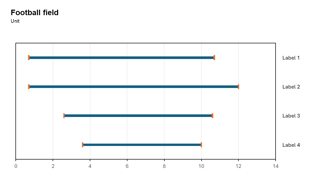
Football Field Chart
To showcasing ranges, comparisons, or valuation estimates in a visually compelling and easy-to-interpret format.
Common uses: Comparing valuation ranges for a business, benchmarking performance metrics like revenue growth.
Key Insight: To show comparisons across different metrics or scenarios, making it especially popular in financial analysis, valuations, and benchmarking
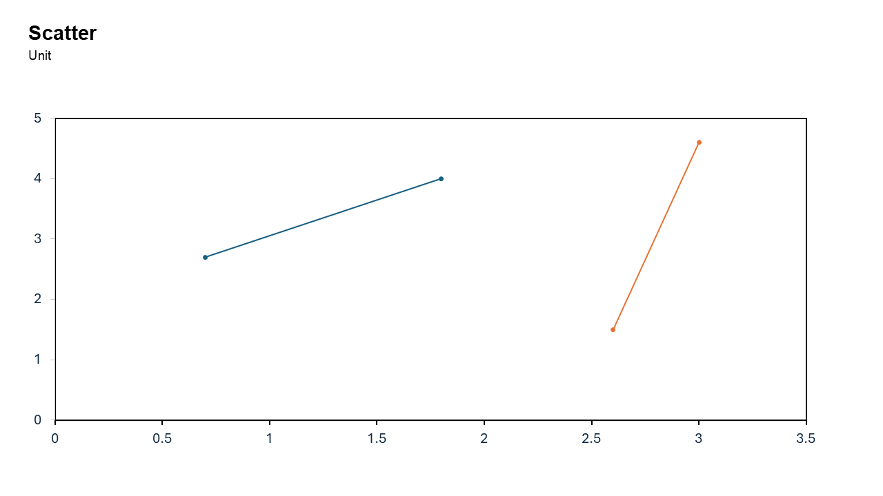
Scatter Chart
Used to analyze relationships between two variables and detect trends or outliers.
Common uses: Analyzing marketing spend vs. revenue, spotting correlation between temperature and sales, or evaluating test scores against study hours.
Key Insight: It immediately identifies trends (positive/negative), correlation strength, data clusters, and outliers.
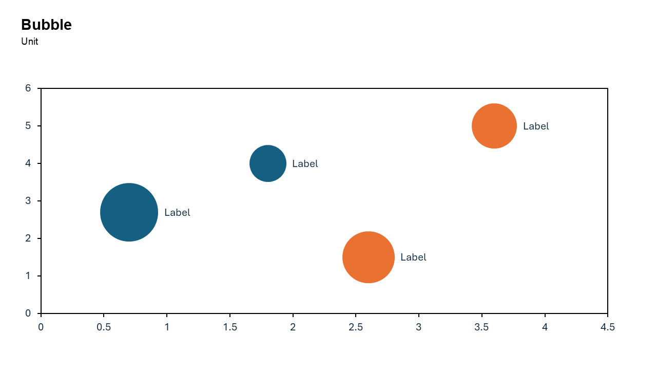
Bubble Chart
Displays three numerical variables simultaneously. Two variables determine the bubble's X-Y position, while the third determines its size.
Common uses: Market Analysis market share (size), price (X), and revenue (Y), project Management risk (position), cost (position), and value (size).
Key Insight: It reveals patterns, correlations, or outliers across multiple dimensions—such as comparing cost, value, and risk—more effectively than 2D charts
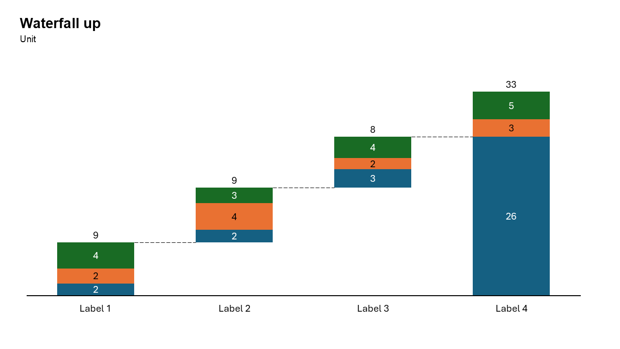
Waterfall Build Up Chart
Visualizes how an initial value is affected by a series of positive and negative changes to reach a final value, using floating, color-coded bars.
Common uses: Finance Profit & loss analysis, sales pipeline or revenue breakdown, staff headcount changes (hires vs. exits).
Key Insight: It bridges the gap between two numbers (e.g., budget vs. actual), clearly showing what drove the change and by how much
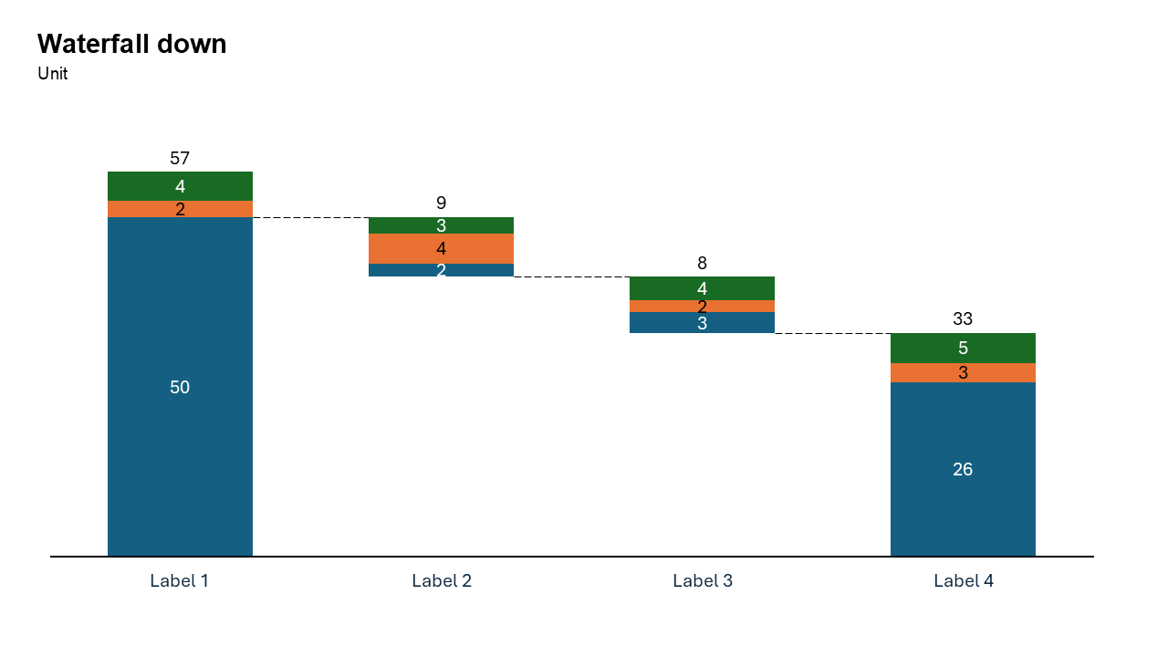
Waterfall Build Down Chart
Illustrates how an initial high value reduces over time or steps due to various negative factors, ending with a lower final total.
Common uses: Inventory Analysis, Financial Performance, HR Management and Budgeting.
Key Insight: It reveals the "micro-story" behind a net change, showing not just that a value decreased, but how specific factors (costs, losses, attrition) caused the decline
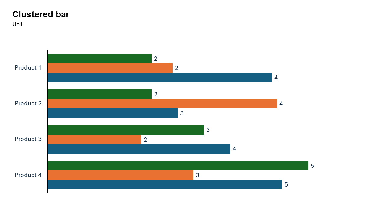
Clustered Bar Chart
To compare multiple data series across categories. By arranging bars side-by-side on the y-axis, it excels at handling long category names.
Common uses: Survey results with long answers, ranking items by multiple metrics, and product performance analysis.
Key Insight: Enables precise within-group comparisons (e.g., comparing "Sales" vs. "Target" for multiple departments).
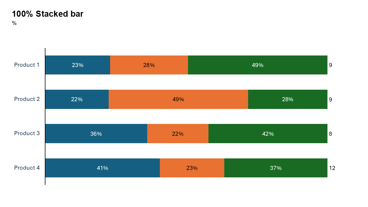
100% Stacked Bar Chart
Displays categorical data where each bar represents 100% of a total, divided into percentage-based segments.
Common uses: Survey responses (Likert scales), market share analysis, budget breakdowns, and demographic distributions. It is ideal for long category labels.
Key Insight: Highlights relative proportional composition (part-to-whole) rather than absolute values, enabling easy comparison of sub-category distribution across different groups.
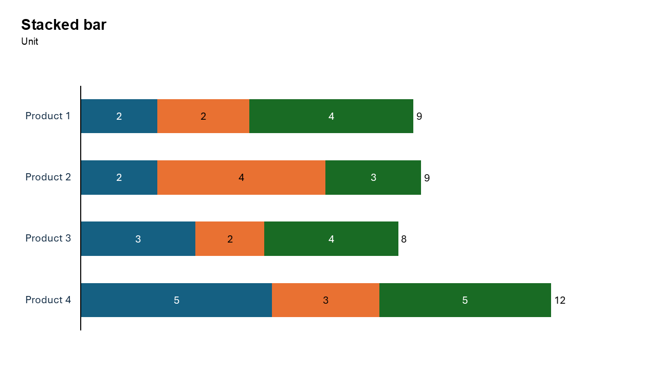
Stacked Bar Chart
Displays categorical data using horizontal bars, divided into segments to represent part-to-whole relationships.
Common uses: Survey Analysis, Budgeting, Market Share, Demographic Data.
Key Insight: Shows how individual parts make up the total value of each category, aiding in both total and segment comparisons.
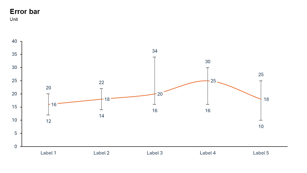
Error Bar Chart
Displays the mean value of data points alongside lines indicating their statistical variability, typically standard deviation or confidence intervals.
Common uses: Scientific Research results from experiments, Visualizing ranges of potential outcomes, such as sales projections or survey margins of error .
Key Insight: Allows viewers to quickly assess if the plotted average is reliable or spread out.
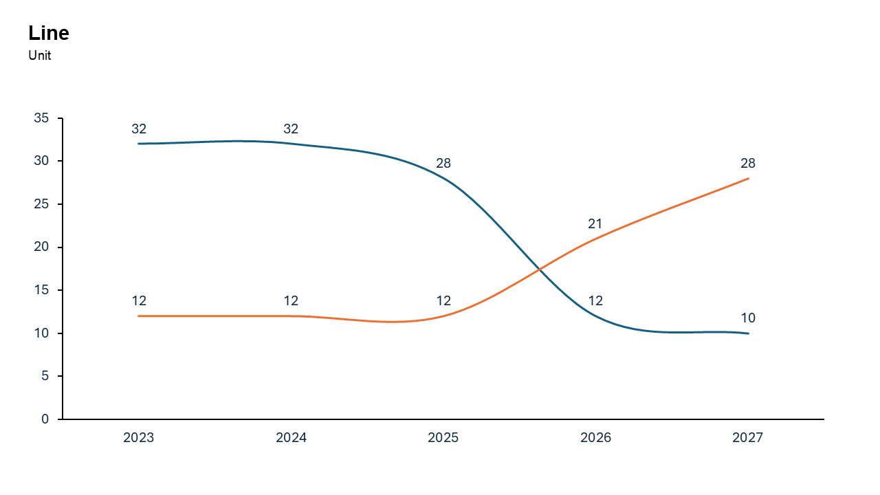
Line Chart
Ideal for showing trends and patterns over time.
Common uses: Ideal for stock prices, monthly sales, temperature changes, and comparing multiple datasets.
Key Insight: It excels at revealing overall direction—rising, falling, or fluctuating—and identifying peaks, dips, and anomalies across periods.
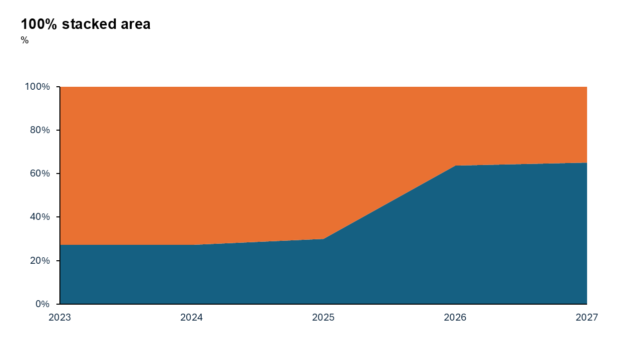
100% Stacked Area Chart
It visualizes the proportional composition of a whole over time, rather than absolute values.
Common uses: Tracking the percentage breakdown of budget allocations, market share over time, or user device usage (mobile vs. desktop).
Key Insight: Highlights relative changes in distribution (e.g., market share shifts), even if absolute totals vary drastically.
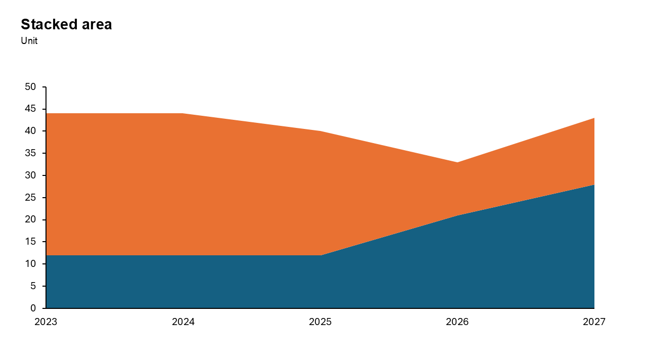
Stacked Area Chart
Each layer representing a part of the whole over time. It highlights how individual subcategories contribute to a cumulative total trend.
Common uses: Visualizing market share changes, revenue breakdown by product, resource allocation over time, or website traffic sources (e.g., organic vs.paid).
Key Insight: Tracks both the total volume and the proportional composition changes, making it easy to see which category drives overall growth or decline
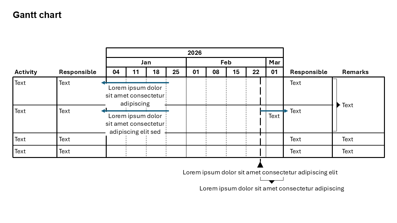
Gantt Chart
Displaying tasks as horizontal bars over a timeline, mapping project schedules, durations, and dependencies. It enables tracking progress, allocating resources, and identifying the "critical path" of mandatory tasks.
Common uses: Project Scheduling & Planning, Progress Tracking, Resource Management.
Key Insight: It centralizes complex project information into a simple, at-a-glance roadmap, highlighting task dependencies to prevent cascading delays